Building for the Big Game and Beyond
Published on April 17, 2024


Hologic is a global medical technology company focused on improving women's health through early detection and treatment. Hologic has operated for 36 years, has a presence in 30 countries, employs over 6,000 people, and holds more than 3,000 patents.
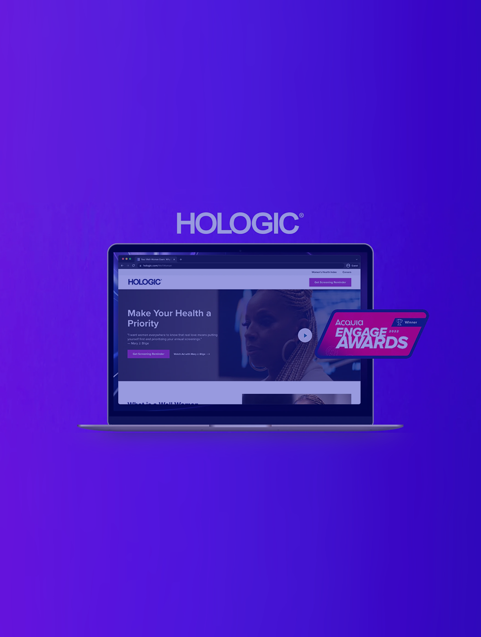
Hologic needed a microsite that could effectively support their Big Game campaign – one that could handle the traffic of millions of people visiting the site, communicate info to multiple audiences of women and their families, and demonstrate world class branding – with a tight build timeline of under six weeks.
Impact: This was the largest and most successful campaign Hologic had ever done. The microsite we built was equipped to handle the immense traffic surge without faltering, while serving tailored content and experiences to capitalize on the increased traffic generated by this campaign. All this was made possible within the tight deadline by building on top of Hologic’s platform powering their broader web presence.
At a glance
Increase in search term traffic
Social impressions garnered
Conversion rate across KPIs
Context & Challenges
Supporting millions of viewers from the Big Game on one microsite.
Featuring their ad at the Big Game was a momentous opportunity for Hologic. Not only was this one of the world’s most impactful sports programming events, it was also Hologic’s first B2C campaign – a campaign that could help save women’s lives.
Millions of people would be watching. Hologic needed a microsite that could scale to meet immense traffic loads without crashing. The site should demonstrate world-class branding, easily engage new audiences by raising awareness of the importance of well-woman exams, and ensure the brand was appropriately incorporated. It also needed to effectively support unique functionality tailored to various audiences visiting the site.
We had a slim, six week deadline to launch an MVP of the site – a challenge we felt confident tackling because of our great existing partnership with Hologic. This was a multiple agency setting where we needed to collaborate with not only Hologic stakeholders, but with other agencies involved. There were also numerous legal, regulatory, and celebrity standards to adhere to. The microsite needed to have new content mapped to pre-existing functionality on Hologic.com. All this combined, it quickly became a question of what we could actually accomplish in the short amount of time we had available.
Hologic’s main goal with this microsite was not about making sales, it was truly about advancing their mission, raising awareness of the brand, and educating women and their loved ones about the crucial importance of well-woman exams every year. Sadly, many women don’t go until it’s too late. This campaign could lead to many women’s lives being saved by generating ample awareness.
Our approach and solution
A one-week build achieved with Drupal and Acquia Site Studio.
This being Hologic’s first B2C campaign, they required as much time as possible to focus on the creative elements, meaning less time allocated to building the site. We prioritized ideas that aligned their existing functionality with their design system, along with functionality within Acquia Site Studio to make this possible. This helped us jumpstart the development for specific features while we further defined features for potential new functionality as we continued iterations. New features were prioritized based on the impact it would provide Hologic and their site visitors, along with how easily and quickly the features could be implemented.
We were able to fast track this site build to a week, allowing full focus on the creative side for the remaining few weeks available. This was made possible by leveraging tools like preconfigured design system helpers, Acquia Site Studio elements and components.
Existing Site Studio configurations empowered FFW and Hologic to implement the campaign within one week using:
Preconfigured Design System Helpers
Site Studio Elements and Components
- Layouts
- Modals
- Accordions
Video Components
- Background Videos
- Modal Videos
Using an accordion component to speak to a variety of audiences
This site needed to be useful for the vast audience seen at the Big Game. It was intended to not only educate a variety of women on the importance of their well-woman exam, but their loved ones as well. We leveraged an accordion component on the page that provides information for women in different age groups and what kind of testing should be done, so women and their families visiting the page could drill down to info that’s most important or relevant to them. The beauty of using the component library inside Site Studio was the speed we were able to build functionality like this.
Scaling for massive traffic spikes
Driving millions of people to a single microsite can result in the site crashing if not done correctly. One thing we needed to prioritize was having the right data tracking in place. The Drupal CMS platform combined with Acquia Site Studio allowed us to reliably scale those massive traffic surges.
Result: Hologic’s most successful and impactful campaign of all time.
Hologic’s microsite was launched in time for their campaign ad to debut during the most-watched telecast in two years, with the platform scaling gracefully under massive traffic surges stemming from the views. Using existing technology configurations with Drupal and Acquia Site Studio, Hologic and FFW were able to build and launch the website for the company’s most successful and largest-ever campaign in only six weeks.
This campaign has done incredibly well raising awareness of the importance of scheduling well-woman exams, while generating positive awareness around the Hologic brand.
Technologies
Drupal (CMS) and Acquia Site Studio
Results
-
01
Increased traffic
Generated a "halo effect" resulting in increased traffic across the entire Hologic corporate site
-
02
High conversion rate
Nearly 15% conversion rate across all KPIs (11% of users visited the page multiple times)
-
03
Increase in search traffic
Significant increase in search traffic: Search terms including “Hologic” have increased 80% since the ad’s debut in February 2022
-
04
Site visits
260,000 visits to Hologic.com and screeningsforher.com in one month
-
05
High impressions
1.2 million impressions across all social content with a 6.58% engagement rate (nearly 50% higher than the national average at 4.59%)
"Automating our complex route price management with Templates upleveled our digital marketing and gave us a competitive advantage."
Jenifer Snow
Manager, Digital & Brand Strategy at Hologic

Insights


